Showing posts with label distress inks. Show all posts

Monday, March 16, 2015

Another Accordion fold card!

I love love Accordion Fold cards...I love the space it has for writing oodles and oodles of notes!! Its like a card but a hidden album all in one! Check my previous Accordion cards here and here...
So when I had to make a custom one, for a couple celebrating 7th anniversary, I decided this was the way to go!!

So here go the pics! I have shared most of these on my Instagram...so if you don't follow me on IG, please do.. You can find the link on my sidebar.


So these are my newest toys...my new Dye inkpads from Ranger...And they are amazing!! I might do a review of these soon, though I have a few posts pending too! So lets see...but they are 100 times better than Memento dye ink pads. That's for sure! 

 I had this vision of creating a starry background and the couple being framed in the moonlight!
So these are my failed and working experiments with it. For the bottom one, I tried texture paste, but I didn't like it. Plus the colors of the sky were not too right...so same the middle one...the colors of the sky were good, but the masking fluid  that I used was not right, it peeled off in the middle. so another fail!
The last one I was happy with..

.How did I make it? 
The first thing I did was mask off a circle with a post it punch out. Because the masking fluid was not working for me!
Then I picked up my distress inks - salty ocean, tumbled glass, milled lavender, dusty concord and seedless preserves. Once done, I heat set it.
Then picked up my stars stencil from Memory box, and use a ink blending tool, and applied  Frost White pigment ink by colorbox, on the base...I varied the pressure, so some stars are bright and some are faint. After applying pigment ink, I again heat set it. Because pigment ink takes a long time to dry!
so here goes the final look of the card..


I did not want to overwhelm or cover that gorgeous inking so I kept it very simple. The banner, is done using my sigma micron pen (05) and sketched on the cameo. I love how versatile the Cameo is!

 A few spritz of Silver shimmer from Lindy's sprays and the card front was done! (click to enlarge the pic and see the glitter!)

The accordion has 7 pockets for 7 tags. All are lightly inked.

And this is the back page of the card, This awesome awesome chalkboard type label was sketched with my white gel pen in the cameo. To give a faux chalkboard effect, I took my white pigment ink and without re-inking on the ink pad, used the foam applicator and brushed it across the black cardstock. And that's it!

I love the Gelly Roll pen and it works wonders on dark cardstock . Leave me a comment or shoot me and email if you want to buy this white gel pen. I managed to get some extra from my craft store! The uniball signo somehow doesn't work this white for me!

Coming up soon, a tutorial for the slider card...

See you soon!
Tejal

Tuesday, July 31, 2012

A scene inspired card

Ever since I had been following Michele Zindorf's cards..I wanted to create scenes...and never got the motivation...now I did!!
After seeing Isha's card on "Do more with Less" I was determined to make one...just to take part in her challenge!!
I love her cards and this was my way to say, Thanks for all the inspiration! (Sorry Isha for not finding time to stop by your blog for soo long!)

And also linking this card to Anne Gaal's 4th Blogoversary Celebrations! 


This is simple blending with distress inks...and some masking with a circle post it...Those birds are hand drawn!

Inks used, Mustard seed, Wild honey, spiced marmalade, dried marigold, and fired brick. Memento Black.
Sentiment Papertrey ink.Hero arts- garden bouquet, Antique engravings.

Will be back to post the other cards soon...Had to share this card first, coz else I would have missed out on the deadline! :)


Friday, May 4, 2012

Buying your first Distress inks!


These tutorials are a product of extensive reading, researching and lots of time spent on making them. Please do not copy, or share on your page (for promoting your items in your shop) unless I give you permission to do so. Please ask nicely....I won't say no...but you need to ask.... You can link it on your blogs if you have used these tutorials...please share the link with me when you do use these tutorials...I would love to stop by and see what you have done! 

Planning to buy your first distress inks? Confused as to what colors to buy? Don’t know where to start?
Do I sound like one of those telebrand ads? I think I do!!

 It is confusing if you have a limited budget and over 36 colors to buy..  I had this post long time in the making! I had a lot of people come and ask me how to buy or how to choose the distress inks!

So I’ll just break it down for you, as to how I brought them. 

Whenever buying inks or paints that have too many shades of colors…pick the basic ones first..then buy one color lighter and one color darker than the one you have…In distressing, it gives you a perfect blend…and in coloring it gives you fabulous shading! 

So having said that…what will be your basics first 5 colors?…

Distressing isn’t complete without Vintage Photo..so that’s your first
 
Then pick one blue, green, pink and yellow. 

So your first ever colors could be (This is how I bought my colors, you may choose to differ…this is just a guide..not a rule)

Vintage Photo
Shabby Shutters (Green)
Broken China (Blue)
Worn Lipstick (Pink)
Wild honey (Yellow orange) 

Then you can pick your next set…adding one shade darker and one shade lighter to each of the above…

Antique linen (Lighter than Vintage Photo) & Walnut stain (Darker – I don’t own nor need this color since I prefer fresher colors..but you can if you are going for dark vintagey projects)

Green family- Peeled Paint (darker than Shabby shutters)  & Bundled Sage/crushed Olive (lighter)..

For Blues family – Tumbled glass (Lighter) and faded Jeans (darker blue)/also Chipped Sapphire

For pink family – Spun sugar (very light pink) and  Barn door (darker- it is  more of red) /victorian velvet (muted pink). 

Yellows -  Mustard seed (pure yellow) and rusty hinge (darker shade of orange)
That brings you to around 15 inks! 

Then you fill in the missing gaps…like purple – Milled lavender and Dusty concord

Reds – Fired brick and Aged Mahogany (Dark reddish brown)

Ranger has new bright colors too now...and I love them. My favorites are Salty ocean (blue),
picked Raspberry (pink)
 mowed Lawn (green)
squeezed lemonade (yellow)
Ripe persimmon (orange)
Festive berries (red)

I seem to think these are enough to start with…I have bought more colors, but haven’t touched them…coz they’re the extras…purples and lightest pinks etc..which aren’t that much used…What I use most are my top 15 colors!!
Always keep a color chart for your reference…You can download and print it off the ranger website…and keep adding the colors you get…
And another tip…store your inkpads upside down..they’ll always be juicy when you get down to using it…Since I store my inkpads sideways..I make sure I keep rotating them..else they would dry out in the 44C heat ! 

As always feel free to ask questions....your questions help me learn more and maybe help others who have the same doubts! 

Hugs! Tee (my new name....psst Khush I love it...and my husband has forgotten my original name ..he calls me Tee now!!)

Wednesday, November 30, 2011

The Reveal

There's not much to post today....but I thought I drop in and show you what I was upto with that rainbow colored paper!!
If you missed it, I'd shared it on my yesterday's post. Here it is again...

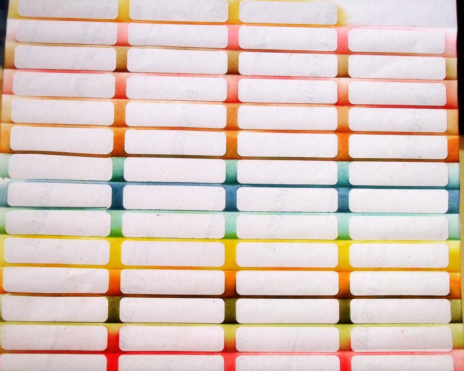
 Quite a few of you guessed them as labels....yup those are labels...I was busy playing with distress inks and labels. I was organizing them.... I used to have a hard time pulling all of them out just to see which one I wanted!!!
So after all the inking and playing with inks and sponges....Ta-da!!!! All four sides are labelled so I can put them however, and still see the name of the ink pad!


I love the rainbow colors...and just in case you are tempted to say...so many colors!! It took me one year to come to these colors...I buy as I use...I can always share what I learnt from a blogger pal Britta on how to buy your first distress inks!!

And now it is so easy for me to pick them out of my box of inkpads!! Yeah the foams are also color arranged!! Just for a few days...it will be messy as usual!!

Its a bit messy but that's how it is!! As long as the box closes I have no problems!! :)

I'm sure you will want to ask me a hundred questions!! To the left are my memento dew drop inkpads, the red bottle is the ranger solvent cleaner for my stazon ink. Ask me if you are any more curious!!

Saturday, November 5, 2011

Dots and stripes

Hey everyone…it’s the last day of holidays for me..well for hubs actually…which means more time for myself…certainly will miss bugging him all day!! Oh well, another holiday looms on the horizon for us..10 days in Jan. Want holidays, marry a lawyer!!

Ok enough about holidays…did you check out the card on the Pie lane blog? I loved making it and its so easy, even the most novice card maker could make it…do drop by…


I don’t know what prompted me to create such a bright card…but bright it is…Base is Peacock Blue Fabriano CS.

The distressed panel started as White CS (Brustro) and distressed it with Wild honey, and Spiced marmalade (that is one heavy orange color) and a touch of Vintage photo.
Stamped the hero arts flourish background (thanks you guys for this fabbie stamp) with spiced marmalade. Tags are hand cut, added a punched 5 petal flower and punched a hole through it..tied some charcoal twine. 

Pattern papers are from Itsy bitsy. The paper is double sided, and I’ve used the orange polka dotted side to punch butterflies in( 3-in-1 butterfly punch), and the striped side to add a border…which is also punched with Threading water Fiskars punch. 


A bit of Sakura Diamond dust on the butterfly completes the card…
Sentiment is from the Penny black Betsy bluebell set (see I used both my sets!!!)
 How could I not show my butterflies?

Just a shout out for a fabulous girl's give-away...Priya Sivaraj is celebrating her blog anniversary and her wedding anniversary with this fabulous goodies...drop by her blog to wish her and maybe win yourself some fabulous crafting goodies!

Also I'm cleaning out some old hobby ideas clear stamps at throw away prices...if you want to have a look, check out my sale page...

Tuesday, October 18, 2011

Pink, White Black and Butterflies!

Before I jump into explaining my long title...let me first share that my first ever easel card with the cutsie Owl was one of the Top 4 at Lily pad Cards....YAY!! Its a fabulous feeling! Thanks Miss Boo for letting me know!!!
And now to today's post...
As the title says, Its gotta be a pink, white and black card...and this is the first challenge on Gopi Patel's Create Me Pink Blog..

Since I was in the previous card mode...I whipped up a similar card using the colors of this challenge...BUT, I used the Heart wings butterfly!!! Thank you Manasa for sending this to me on loan...I love it....Thanks girlie...

The Magical Background is embossed in black and then applied Worn lipstick to the front and just a touch of Fired brick Distress inks to the edges. The Butterflies are stamped and embossed on Vellum with white embossing powder and sentiment is from Papertrey ink..heat embossed in black.
And if you can see a not-so-subtle shimmer on the butterfly hearts, its from the Sakura Diamond Dust glaze pen...

Also for CMP's First challenge, there was Pink Pick..to use one other embellishment...I've used rhinestones on the butterfly body.


 Couldn't decide between the white and black background, so showing you both!!

Also picked up a small trick from Jennifer Mcguire's inspiration Showcase class of propping the wings up...they won't ever fold down...just pop a small bit of foam adhesive under the wing...


The wings will be popped up even after mailing!! Isn't that gorgeous??
So that's it from me now..in case you want me to post details about the same blue card...let me know..I'll make a post for that too...


Wednesday, August 3, 2011

Creating a Scene...

Not its not what it sounds like...but have been on a spree on creating scenes...especially after getting my new distress inks and hero arts stamps...I created 5 card fronts in 2 hours..but those are still awaiting cards...that later...today for the card that makes me squeal in happiness everytime I look at it...

This card is for Hero Arts August challenge - to create a scene...


Ever since I found a wood-grain texture paper from a local store, I have been dying to use it...and this was the perfect opportunity!!This card is for my BFF since school days...but always a phone call away...haven't met in a quite a bit of years...but that doesn't stop friendship...


I love this CS...but it was a very pale beige color...to make it look like actual boards, I cut apart the strips and distressed them with Vintage photo..the ink brings out the texture of the CS..
The curtains are parchment papers, cut free hand and colored with bic-markers...and the frame around the window (which looks lavender, but is brown) is popped up on dimensionals. 
The flowers stamped at the bottom of the card are from the set- be happy and the grass is from that set too...I stamped the flowers on white CS,colored with Niji Pearlescent paints and paper pieced on the card.
The beautiful beads in the center of the flowers and the butterflies are from Pie Lane Studio.

This is the inside of the card...this is what I was playing around with..distress inks, and the new hero arts silhouette stamp- Garden bouquet..I love the contrast of black on the background...inks used for the background are peeled paint, shabby shutters, broken china and tumbled glass..
And I must say, if I didn't have the stamp-a-ma-jig..it would have been so tough to place this perfectly...

The sentiment is from the Be happy set...and goes perfectly for the challenge on Crafty JC-Friends are forever!! and for the Wee Memories - Dare to color challenge


If there is any other thing you would like to know, as always, feel free to ask!!


Just a little pic to show you the metallic sheen in the watercolors that I mentioned in the previous post..and of course the gorgeous little butterfly!!! 

See ya soon!

Sunday, June 19, 2011

Magical embossing!

These tutorials are a product of extensive reading, researching and lots of time spent on making them. Please do not copy, or share on your page (for promoting your items in your shop) unless I give you permission to do so. Please ask nicely....I won't say no...but you need to ask.... You can link it on your blogs if you have used these tutorials...please share the link with me when you do use these tutorials...I would love to stop by and see what you have done! 

When I saw this video...oh my God!! I knew I had to make a card with it...without wasting any time I got down to business!!

I also took step by step photos for those who want to see it! First the card and then the step by step pics!


I love the effect...its just amazing!! no doubt I had inky fingers the rest of the day! This card is specially for Ujjwal's embossing challenge on Yvonne's blog.

Also for Virginia's challenge to create something from an inspiration. My inspiration is the video I mentioned earlier.

So now the step by step. The main panel for this card started out as a white CS. I covered the CS with different colors of distress inks. This panel has soft colors because I blended the colors. For stark colors, rub the ink pad straight on the paper as in the video.

 I used Broken China, Wild honey, Worn lipstick, Shabby Shutters.
Then comes the step of  stamping with Versamark and embossing with clear embossing powder.

This piece is different than the one above...I messed up the first CS, so had to re-do this. Just showing the clear embossed butterflies. Used Hero Arts Antique Engravings.

Then comes the magical step. Take black ink, a sponge and rub it all over. Make sure you use a dye based ink, anything that is water-based. I used Faber-Castell black ink pad, the regular one in the market. I used a cosmetic sponge, cheap and disposable. A water-based ink is easy to rub off the embossed image, other inks will stick to the image.
Use a dry tissue and rub off the excess ink of the embossed parts...and here's the result.

Get it as dark as you want it to be.
I added some rainbow bling stones, some make up glitter (VOV pearl powder eyeshadow) over the card...cheap and works like pearl powder..(though I have to figure out how to get it to stick to the card)

So there you have it, simply truly magical embossing. Try it and have fun!!
Here's the final card again...coz I can't help but love these butterflies!


See ya soon with another tutorial...on the faux rain...
Let me know your comments and any questions if you have any!

Wednesday, May 4, 2011

My First Distress Inks!!!

I just got my first set of distress inks and one HA background..And I had a blast playing with them. I need to experiment a lot with these... they are so so versatile..I'm still learning...


This is not my best attempt, this is my first attempt..so forgive any imperfections...I love the colors..and most probably will be getting more colors...

I've used Hero arts magical background with clear embossing. Distress inks used are Wild honey, broken china and shabby shutters, along with Vintage photo on the edges and the sentiment banner.
Sentiment is again Hero Arts valentine sayings. Bronze pearls (local find).

So what do you say?
Entering my card into the following challenges
Sugar Creek Hollow - Embossing 
OSAAT - Embossing
The Crafty Pad - Pearls and Swirls

Related Posts Plugin for WordPress, Blogger...